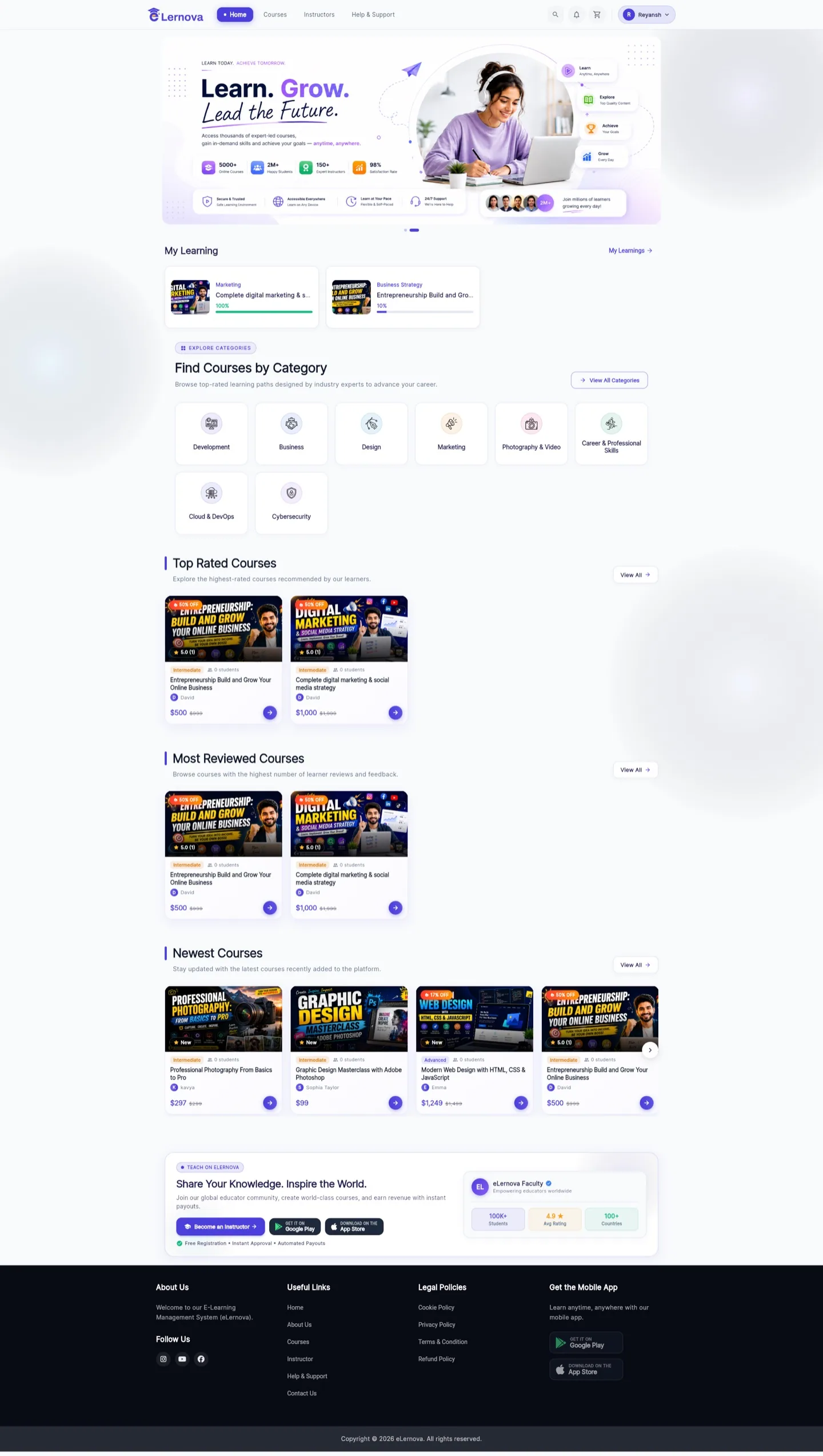
The home page
Arrange what students see first — banners, course rows and onboarding.
Feature sections
Content & Engagement → Feature Sections builds the rows on the student home screen. Each section is a titled row of courses.
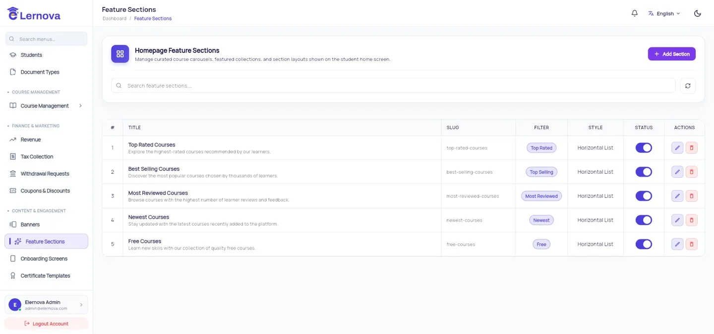
| Field | Meaning |
|---|---|
| Title | The row heading — "Trending now", "New this week" |
| Courses | Which courses appear, or a rule that picks them |
| Order | Where the row sits on the home screen |
| Active | Hide a row without deleting it |
Three or four rows, not ten
The home screen is a shop window, not the catalogue. A student who scrolls past six rows of courses has not found one they want — they have given up. Put your strongest row first and let search and categories do the rest.
Banners
Content & Engagement → Banners are the images at the top of the home screen, each able to link to a course or a category.
Banners are read on a phone
Text that looks fine on your monitor is unreadable at phone width. Keep banner copy to a few large words, keep the important part in the middle (the edges get cropped at different aspect ratios), and always test on a real phone before publishing.
Onboarding screens
Content & Engagement → Onboarding Screens are the slides a new user sees before signing up.
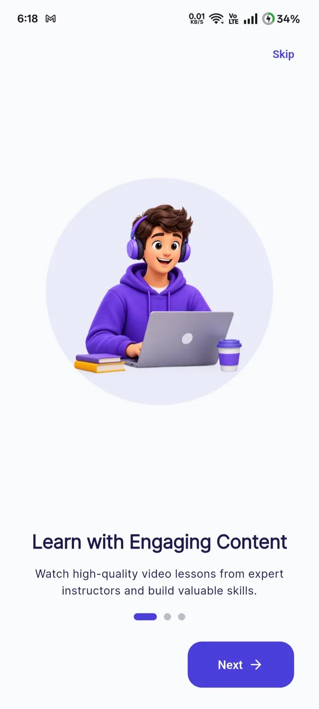
Three slides, one idea each
What this platform is, what the student gets, and how to begin. Every extra slide is a chance to lose someone before they have an account. Say something true about your platform rather than keeping the generic defaults.
What students actually see