

Colours and fonts
One palette and one typeface, applied across the student app, the instructor app and the websites.
Open SYSTEM & SETTINGS → Settings → App Theme & Style.
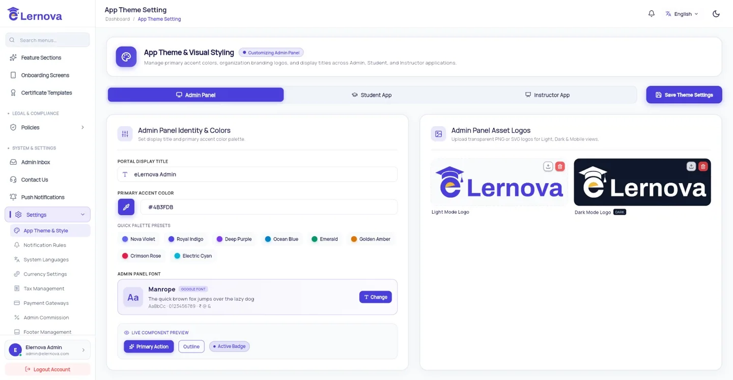
The colours
| Colour | What it drives |
|---|---|
| Primary | Buttons, links, selected tabs, progress bars — the colour people will call "your" colour |
| Secondary | Supporting highlights and secondary buttons |
| Accent | Badges, prices and small emphasis marks |
Each has a colour picker and a hex box, so you can paste a brand value exactly.
Check contrast before you commit
Button labels are drawn in white on your primary colour. A pale primary — yellow, light cyan, pastel pink — leaves text nearly unreadable, especially outdoors on a phone. Paste your colour into a contrast checker and aim for at least 4.5:1 against white. If it fails, darken it a few steps; your brand will survive.
The font
Pick any Google Font by name. The apps load it at runtime, so there is nothing to bundle and no rebuild.
Check your font covers your languages
If you offer Arabic or Hindi, confirm the font actually has those glyphs — many display fonts do not, and students see boxes instead of letters. Noto Sans and Inter are safe across all six bundled languages. eLernova ships with Inter as the fallback.
Dark mode
The student and instructor apps follow the phone's own light/dark setting. Your colours are used in both, with the surfaces swapped automatically — so a colour that reads well on white and on near-black is worth a moment's thought.
Check it worked
Save, then reload the student app. Buttons, links and tabs should take the new primary straight away. If nothing changes, hard-reload the browser (Ctrl+Shift+R) — the old stylesheet may be cached.